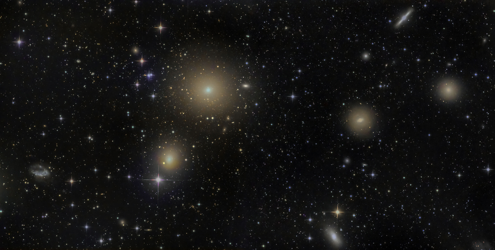
Fornax Cluster

Fornax Cluster
8

Fornax Cluster

Two pane mosaic of the Fornax Cluster from CHI-1 Pro Dataset. I found this pretty difficult to process, blending the panes was rather difficult.
SPECIFICATIONS
Telescope ..........................................................................................................................................................................................................................
Telescope
Planewave CDK24
Camera ..........................................................................................................................................................................................................................
Camera
FLI ProLine PL9000
Location ..........................................................................................................................................................................................................................
Location
El Sauce Observatory, Chile
Date of observation ..........................................................................................................................................................................................................................
Date of observation
19 Sep 2020
Filters ..........................................................................................................................................................................................................................
Filters
LRGB
Processing ..........................................................................................................................................................................................................................
Processing
Pixinsight, Photoshop
The world’s largest database of astrophotography data is waiting for you! Start now your free trial
Try it free
See all photo
Comments

This looks fantastic Jarmo. I struggled a bit with this dataset. I think the left panel had some cloud in one of the subs, and the right panel had a different colour balance to the left. I would be interested to know how you handled these differences and created such a seem-less blend. Great work. Cameron :-)

Thanks, Cameron! I had all those problems in my first version. Maybe you can still see the difference between panels but it is less obvious now. If I remember correctly I had to leave one blue image out of the mix for the left panel. After blending I manually selected the right panel area and darkened the background to make them more even. For the color I did the same and used Photoshop Color Grading to roughly match the colors. So lots of tweaks and trial and error.

It would be great to see your version!