How to get a nice Hubble Palette look


I have had difficulties getting that nice Hubble Palette look in the past. Sometimes it would get really frustrating trying to find the right mix to get it going. I've used APP, PI, and even Photoshop, and still couldn't get ti quite right, though with APP I got closer than with the others due to the ability to do mixing. But now, with the later versions I've finally got it right, and I will pass that along to you.
Using the Heart Nebula One-Click Observations from later last December on SPA-2 I will demonstrate what worked out for me. You can acquire these from here, though I would only grab the later ones since those are at full focal length on SPA-2 and are 600-second subs. https://app.telescope.live/click-grab/all?telescope=42...
On the tools tab in APP you have one called Combine RGB. That is where you can put your mono subs in and do various pre-programmed mixes. The closest I've gotten to a good Hubble Palette was using the SHO (Hubble) 2 mix. It is close, but not quite there. Here's an example:
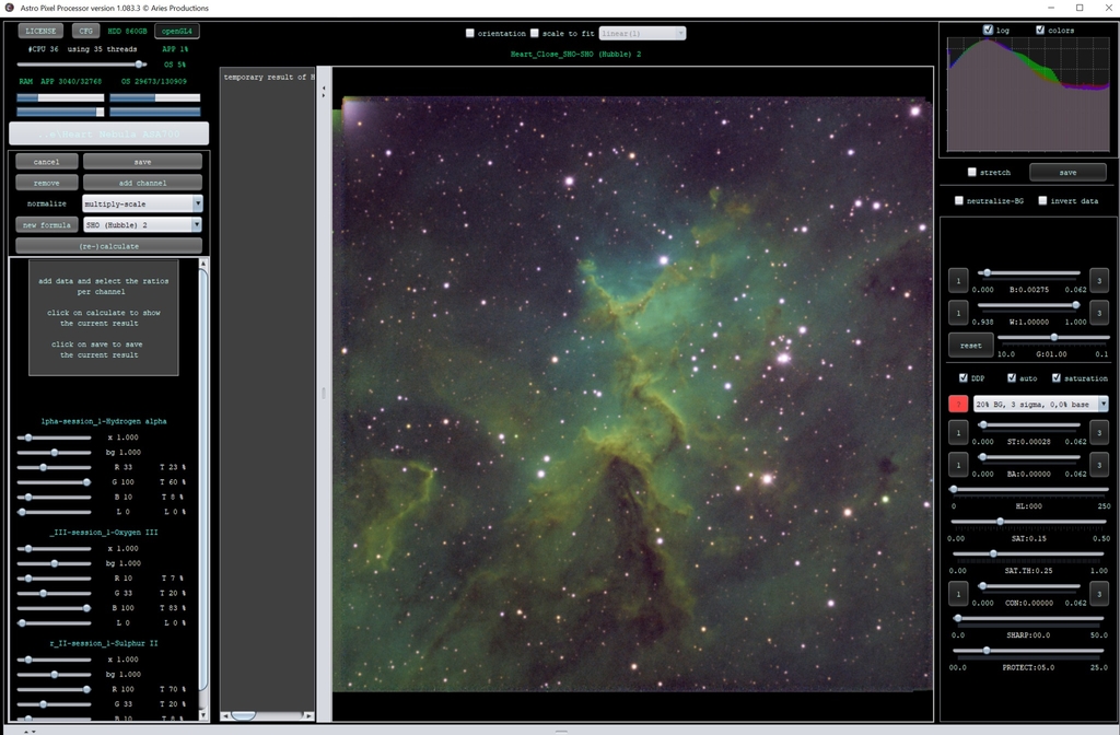
As you can see it is close, but it is also too green and doesn't have that nice pop to it that you see in and of course those purple stars are apparent. You can do adjustments in PI or APP, but if you can get those colors where you want before finishing up the image in another program (or doing all processing here) why not do that? I will make some adjustments to those mixes and we can see what we get. Notice how I have adjusted the sliders:
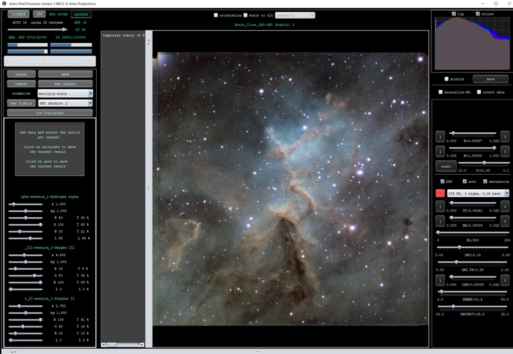
Now, this isn't 100% there, but it is much closer. In fact, it is close enough that I will go ahead and save it at this point so I can crop and then work the selective color tool on it. I would even run the star reducer tool to bring star sizes down a little, maybe to 75 or 80%. I did 80% on this one. Be careful that you don't go too far because halos and artefacts can creep in and your image can become too smoothed out.
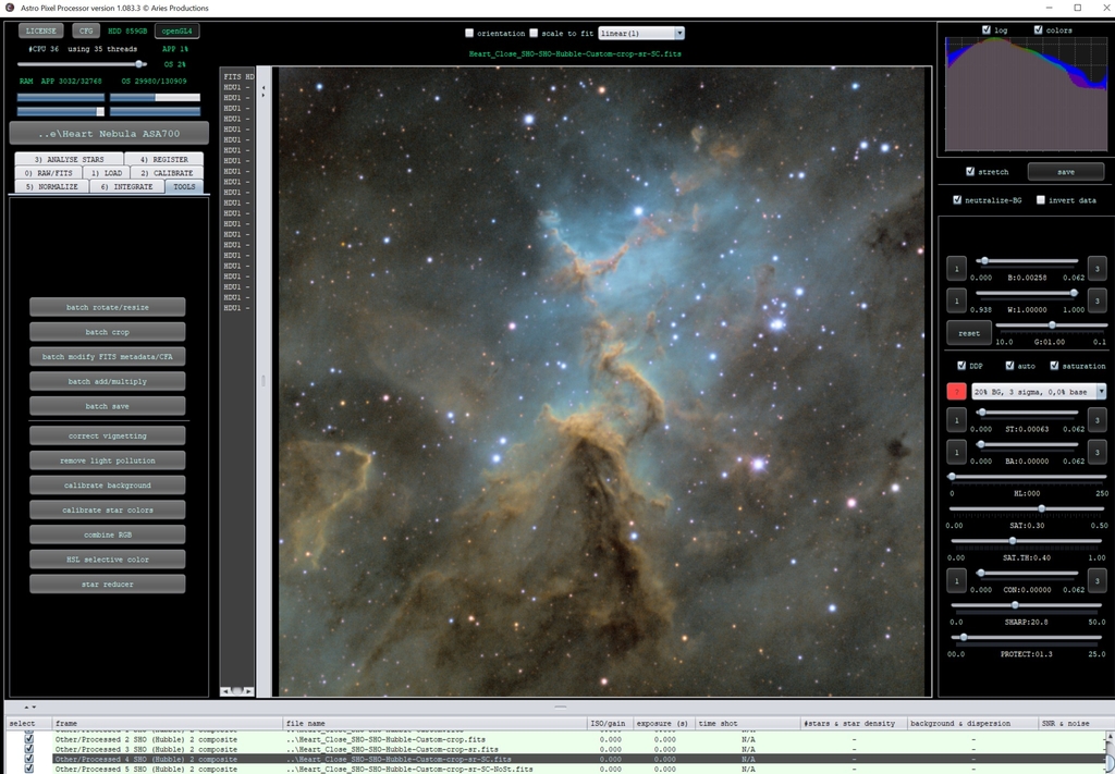
This is the point where I will make the decision to bring it into PI or Photoshop, or of course, tweak a few things in APP and save it as is. If you're taking it into Photoshop go ahead and save it as a 16 bit tiff if PI then do a 32 bit floating point fit. If you have the box on the upper right just below the histogram that is marked "stretch" it will by default save as a 16 bit sRGB tiff, if it is unchecked it will by default save as a 32 bit floating point fits. You can change what it saves as if you would like.
For me, the image is at a point that for a quick process I will take it into Photoshop, though I have saved it for both Photoshop and PI at this point as just in case.
Now, of course, it is time for the quick edited image. At this point I could have taken this into the PI and spent a good half hour on it to really make it pop, but here's what a quick edit in Photoshop gave me. It is the heart of the Heart!
This blog post was originally published in our Telescope Live Community.
The Community represents Telescope Live's virtual living room, where people exchange ideas and questions around astrophotography and astronomy.
Join the conversation now to find out more about astrophotography and to improve your observation and post-processing skills!